I’ve started to view the evolution of our brand much like the forming identity of a human being. Tea Drops has been through many phases -- and that’s part to do with my own personal growth, the contribution of our team members, and the thousands of customers that write in and tell us what Tea Drops means to them. That may not be the PR version of what most brands will reveal, but that’s our truth.
Some companies will say that they knew exactly who they were from the beginning, and any brand shift is just an extension of that core identity. I admire those that have an established base with little deviation, but I’ve also found the path of discovery to be incredibly fun.
Just like a child first navigating this world, you may know facets of who you are but you may lack the words and understanding to really introduce yourself. For us, you can see this in the first generation of packaging. My brother, who was a designer at Google at the time, helped craft my initial logo (pro bono!). In fact I have his initial sketches of us brainstorming the logo -- something to convey the drop and simplicity of Tea Drops. To match the earthiness of the wood box, we kept the logo in earth tones. I sketched out the directions on the side of add / stir / enjoy. But to be honest, I had no idea who our teas would resonate with so I tried to make it more gender neutral.

My brother's initial brainstorm for logo design circa 2014

The first generation Tea Drops box
Has anyone tried designing a logo on a string shoe budget? 🙋I can relate. I started Tea Drops with my own personal savings and hadn’t even thought about allocating budget to design on top of everything else. I pulled together some freelance design resources to design our first grocery retail box for a show in June 2016. I remember, I had no idea what a UPC was and originally sourced one from an illegal website (don’t make my mistake, always use GS1 codes).
Here is what our VERY first grocery box looked like….

And then it slowly evolved to this when we received constant feedback that the Tea Drop on the front accompanying description did not distinguish how this was different from a tea bag (I know, duh…).
The original was also designed as a horizontally designed package that took up too much real estate on shelf, something I came to learn was VERY valuable. What’s funny to me is that things that seem SO obvious to you post design, are simply not even in your periphery. I guess that’s why they call it hindsight.

Having the Tea Drop front and center on our packaging certainly helped, but I also knew that our story was missing. We were limited on packaging real estate and around the same time we went through an intense branding/logo refresh. The story of who we were was also evolving as more and more customers were telling us what Tea Drops represented to them. They kept using words like “magic”, “fun”, “cheerful.”
We used this feedback and our natural evolution to solidify our core. We grew up a bit, and understood the details that mattered to us. We knew what we wanted to convey and how we wanted to convey it. Being organic, fair trade, kosher, and woman owned were all staples of our manufacturing practices that we were really proud of. We wanted those dimensions of our brand to have more of a voice.
We also wanted our decadent tea profiles to offer more description. Being able to describe the merits of the shape of the Tea Drop versus a tea bag was also important.
We realized that this communication could not be achieved in a box format, so we looked into other packaging formats that would help communicate our story. We finally found a cylinder body that would help us delicately balance brand story, product description, and sustainably house our Tea Drops.
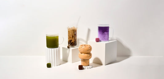
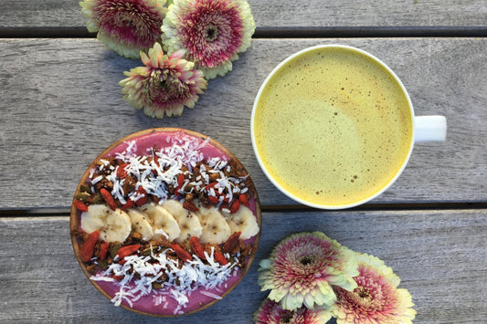
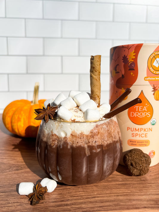
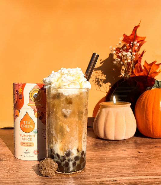
It took time to really study each Tea Drop profile and identify the mood, color palette, and visual translation of each tea. I look at each Tea Drop like a little child, with their own distinct personalities, moods, and traits. Staying true to our whimsical nature, we opted for a colorful tapestry of packaging. One that hopefully engulfs you in the feeling and flavor or each tea.


 With this new direction, we are gratified that our story, our mission, and our values are just as clearly on display as the uniqueness of teas.
We have also opted for 100% recyclable and biodegradable packaging. We’re proud to move in the direction of a more eco-friendly experience.
We hope you love it just as much as we do, but we can’t promise things won’t change (for the better) in the future.
XO,
Sashee Chandran
Founder & CEO